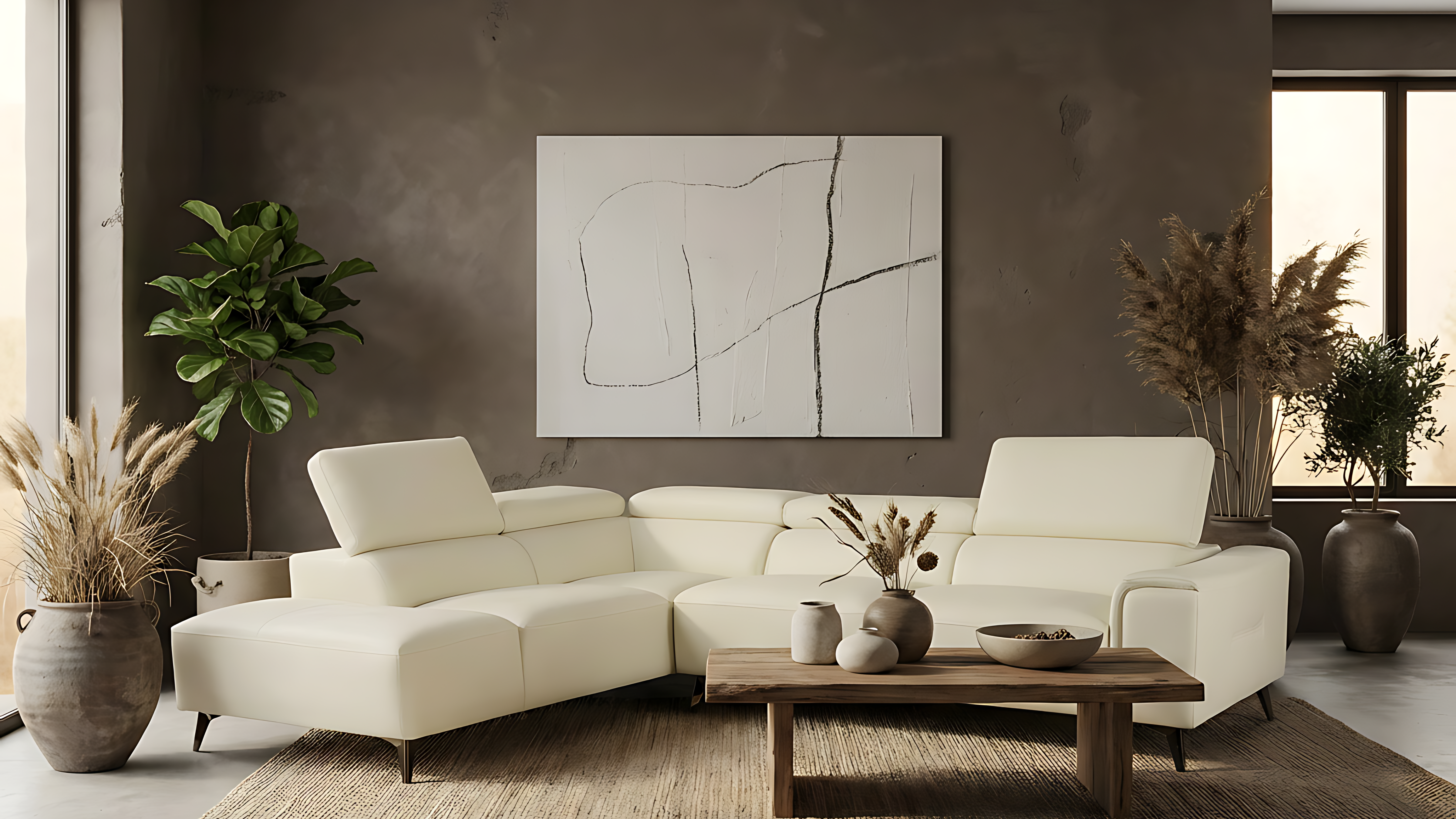
This catalogue was designed with mobile in mind from the start. Most people are scrolling on their phones, so the focus was on making the experience feel simple, clear, and easy to move through.
The layout is clean and image-led, allowing the products to speak for themselves while still giving enough information to make a quick decision. Everything from spacing to hierarchy was considered, so it works naturally on smaller screens without feeling cramped or overwhelming.
The aim was to create something that feels less like a traditional catalogue and more like a seamless browsing experience, which aligns with how people shop today.